


It gives me so much delight to see the fruits of one's labor.
I have grown fond of Letterpress printed paper creations delving into this current stationery realm. The aesthetic allure of seeing the transference from a hand drawn image to a digitally enhanced translation to a tactile pressed, published finished piece.
Happy New Year! to those I have not greeted yet. A long awaited update for work I
have not shown yet. Here is what I have been up to at Serimony and personal projects I've been working on. Enjoy and please let me know what you think :)

Still in progress....
Vector collaborative illustration with Karen of
New York Institute of Technology de Seversky Mansion in Long Island
for a custom wedding invitation

Halloween 2o1o

Labor Day
September 2o1o


Storewide Jewelry Sale sandwich board sign
chalk
August 2o1o

Memorial Day
May 2o1o

Door signage

Monogram initials for a couple and their daughters for a custom invitation
A hand drawn sketch custom illustration of General Potter Farm wedding venue in Spring Mills, Pennsylvania to be digitally printed in navy blue ink for a pocket fold wedding invitation wrapped with a belly band showcasing a vector illustration of an alternate view of the bank barn. Invitation co-designed and finalized by serimony.
 |
| General Potter Farm illustration for a custom wedding invitation drawn at Serimony |
 |
General Potter Farm vector illustration alternate view for belly band
|
 |
The finished pocket fold invitation designed by Karen Van Every at serimony
showcasing my illustration views of General Potter Farm in Spring Mills, Pennsylvania.
|

 |
The finished belly band with my vector illustration
of General Potter Farm alternate view designed by Karen Van Every at serimony.
|

In April of 2o11, I relocated to Park Slope to fulfill a new position at a friend of Serimony:
Lion in the Sun
While here, I have been engaging in new design work and having fun with merchandise display.


August 27, 2o11
Some of my first work was laying out graphics for wedding invitations:


August 11, 2o11
During the week, I help out at Lion in the Sun's studio in Gowanus, PostScript Brooklyn.
A design studio that features an exclusive line of custom invitations by local Brooklyn artists.
Lately, I've been delving into online advertisements for
Design websites that feature lovely paper, invitations, photos and our line!
Please click on the corresponding links to peruse through each website :)

Here is an animated GIF that featured on Design Sponge


On the right hand side second horizontal
is the first panel of the animated GIF for the PostScript Brooklyn ad.

The violet panel is the second of the animated GIF ad

The third and final panel featuring the Summer Sale promotion.
100 layer cake website ad actual size

Chocolate brown and fuschia colored PSB ad on the right hand side

Style Me Pretty website ad actual size

Charcoal gray and chartreuse ad on the right hand side
I love their background wallpaper. Been into Chevron/zigzag a lot lately.

New larger Ad I designed the layout August 29th for Post Script Brooklyn on www.ohsobeautifulpaper.com

www.ohsobeautifulpaper.com ad actual size
The second letterpress printed piece/first at work typeset font play:


photos by Dave Morris
"why we love paper #96"
A digitally designed Playbill-inspired Wedding Program
for a witty couple designed at the studio and digitally printed.
for a witty couple designed at the studio and digitally printed.


Four months of intensive and worthwhile work
The third letterpress/ First commissioned illustration! for a whimsical wedding invitation for a fun and vivacious couple taking off on a balloon with paper cranes blowing in the wind on a book fold invitation layout spread..

Commissioned portrait of the couple taking off on a big balloon


A couple of paper cranes sitting on a branch with fall leaves blowing in the wind


The drawing process:


"why we love paper #128"
Featured on:
http://lioninthesunps.com/2012/01/blog/why-we-love-paper-128/
http://www.theknot.com/Vendors/Lion-in-the-Sun/Profile/INV/182/634579/profile
July-September 2o11
Designed an artsy edgy simple black and white invitation suite with red pops of color and black ink
paint splatters for a Wedding Rehearsal Dinner to match the look and feel at The House of Sweden in Washington, DC.
 |
Custom Letterpressed Paint Splatter Rehearsal Dinner
Invitation at an art Gallery in DC
|


August 29, 2o11
A custom trifold wedding invitation for a couple who was inspired by the venue's tile detail.


photos by Dave Morris
http://lioninthesunps.com/2012/08/blog/why-we-love-paper-176/
Wedding Day of Menu and signage
with fun font play


July 13, 2012
Here are the printed pieces featured
on PostScript Brooklyn's blog
October 2o11
An engaged bride visited the store one weekend with a special request, a wacky custom
Save the Date invitation with illustrations of Wind in the Willows characters, a Revolutionary War theme in a Boston harbor setting. What concluded were illustrations of their favorite animals, (and mine)...seals-Harbor seals.
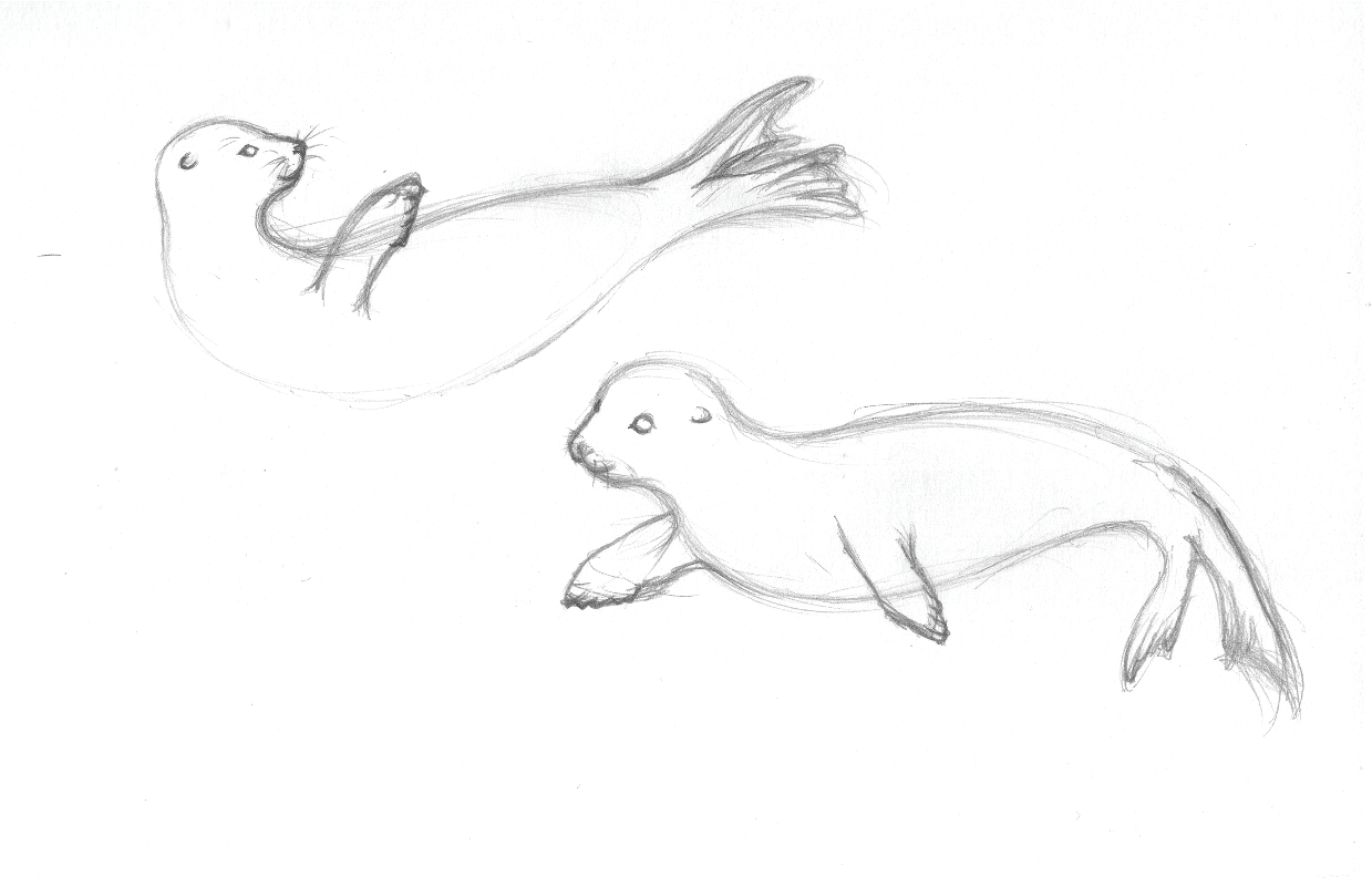


The delightful couple decided to take elements and details from their Save the Date
and showcase the harbor seals illustration on their Wedding Luncheon invitation
in black and turquoise letterpress inks with a fun magenta polka dot envelope liner.

Please view more photos on the Lion in the Sun blog post:
An aspiring professional art enthusiast seeking to broaden her horizons
with personal and business promotional stationery visited the store with a unique antique
letterpress key. She commissioned a custom replication of the design to be converted as a vector logo.


With the recurring trend of creating a Save the Date invitation in a Vintage Postcard fashion,
here are some modern-turned-timeless Save the Date postcards inspired by authentic vintage postcards and personal photographs significant of the couple-to-be's wedding and venue.

Creating a vintage sepia tone effect and some Photoshopping on an authentic elegantly composed photograph of the dapper grandparents of the couple showcased as their Save the Date Postcard

Taking elements from an original vintage Postcard to emulate the feel
of a timeless memento, the use of a vintage handwritten script font
evokes the whole tone of the Save the Date Postcard.

 |
Here are the printed postcards
 | |||
A second vintage photo Save the Date postcard style with rounded corners to be enclosed in an envelope.
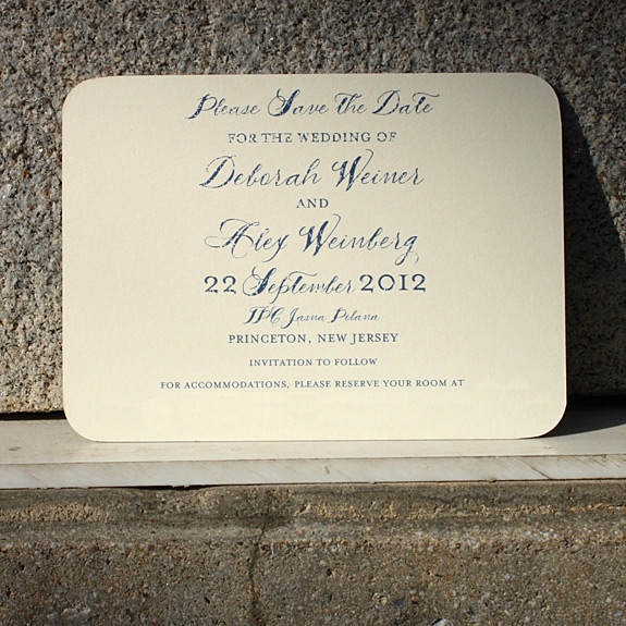
Who would have thought this European villa style estate is a country club nestled right here as a U.S. gem in Princeton, New Jersey, TPC Jasna Polana. With a beautiful photo to start with, didn't want to tone down the rich color of the blue emitting off the rooftops by adding a light sepia distressed look to a quaint Postcard size Save the Date.
|

 |
The previous postcard inspired another couple to showcase their personal photos of their wedding venue
at The Hall of Springs at Saratoga Springs, New York rendered and edited to look vintage and sepia-tone.
|
 |
Elements of an authentic vintage Postcard mixed with a handwritten script font
personal message to their guests were designed to match the front of the Hall of Springs photograph.
|
 |
| http://lioninthesunps.com/2012/05/blog/postcard-save-the-dates-ii/ |
 |
A little font play tweak on the vintage postmark to change to
their actual wedding date as per the request from the bride-to-be ;)
 |
 |
A beautifully colored vintage sunset image of the Brooklyn Bridge supplied by the bride for her Save the Date Postcard.
|


A second vintage photo Save the Date postcard style
with rounded corners to be enclosed in an envelope.

Who would have thought this European villa style estate is a country club nestled right here as a U.S. gem in Princeton, New Jersey. With a beautiful photo to start with, didn't want to tone down the rich color of the blue emitting off the rooftops by adding a light sepia distressed look to a quaint Postcard size Save the Date.

Voila! The printed piece.
This postcard inspired another couple to showcase their personal photos
of their wedding venue at The Hall of Springs at Saratoga Springs,
New York rendered and edited to look vintage and sepia-tone.


A little font play tweak on the vintage postmark
to change to their actual wedding date as per the request from the bride-to-be ;)
Inspired by the horizontal panoramic layout of the #10 Tea length Save the Date
with a custom map of the couple's wedding venue in the Boston Harbor with a debut of illustrated Harbor Seals,
here is the second custom map invite showcasing the Isle of Man.


Also mentioned on PaperCrave's Quick Picks Thursday: 7.12.12

A PostScript Brooklyn-inspired custom Scrabble themed wedding invitation


My new 4by6 Postcards arrived! Digitally printed with Matte Satin finish.

Another #10 Tea Length Save the Date Invitation in the vein of Gevalt's
Custom Vintage Map Save the Date of the couple's venue location located in Turks and Caicos.


A fun Gatefold Save the Date invitation
featuring the couple's personal photo of a bench at the Grand Canyon.


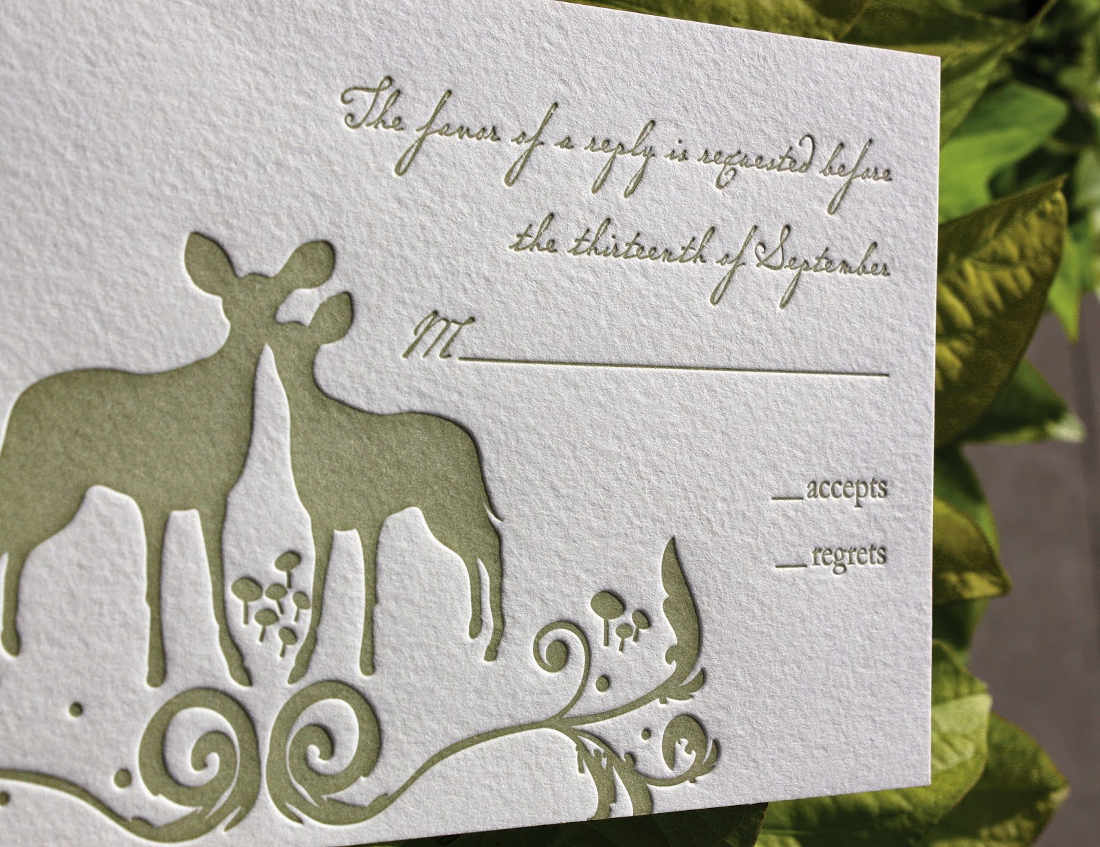
Re-envisioned and designed a whimsical spin on a woodland creature delight featuring fanciful adornments of floral wreathe-like flourishes to frame your declaration of marriage. Originally designed by Foxy and Winston, I added and designed a whimsical spin on our woodland creature delight for The Ramble wedding invitation suite. Drawing inspiration from nature, many forms and colors lend to the details of this design. The curvature of stems and fractal patterns found in branches and flowers help frame your personal message and declaration of marriage to your loved ones.
- Shown with custom fonts in a new 3-color combination:Gold, Persimmon and SquashThis array of bold and autumnal hues is perfect for a fall or wintertime ceremonyand can easily be changed to a soft mellifluous pastel palette for a spring or summer fête.


 (having a little fun at work with in-house staff proofing correspondence)


 An invitation company based in Hawaii reached out to PSBand wanted to feature our destination wedding invitation suite, Come Fly with Me

October 8, 2o12 Kismet color coordination at work assembling Holiday Cardsample kits to promote and mail to all of our media contacts.

 May 23, 2o13
Designed a star-filled twinkling skyline cityscape wedding invitation with matching pattern envelope liner.


 Created a digitally printed chalkboard sign emulating ahandwritten chalk design for the guests to find their seats for the rehearsal dinner event.


 Featured on psbrooklyn:


Post a Comment